Well I splashed out about bought myself some more MFT dies. I love that company – their dies are awesome quality and they ship same/next day – important when they’re shipping overseas as it means I get it as soon as I possibly can this end!
This card is quite a good one for the man in your life. It’s very much “no frills” and to the point. I like the simplicity of it – but don’t be fooled, it did take quite a while to complete.
I like the colour scheme – the grey on ivory is subtle but is balanced well with the pillar-box red hearts and handwriting.
I have done a video – it’s quite a long one, as I’m a bit out of practice ;-$ but I hope you enjoy it anyway and find it useful and inspiring.
Something VERY different for me today to share with you! And a video too, yay!! “Finally!” I hear you all shout…I know, it’s been quite a while. I’m very sorry. As it has recently been described to me – life has been “biting me on the bum” of late, so making card tutorials definitely slipped down my priority list :(
But I really missed doing them, and so I filmed this one for you all. I figured after all this time, this card had to be something a little special, and I hope you agree – it’s definitely different to my usual cards!
I decided to go for a completely different shaped card. I don’t know where I dreamt this particular shape up, but there you go…
I wanted to use these beautiful flocked papers called Paris Nights by GCD Studios. But this card was for a male – so it couldn’t be too feminine! Hence the change in the shape of the card to make it a bit more appropriate for its male recipient. I hope you think it works? I really love this card, even if I do say so myself. It actually pained me to send it, lol! =)
As usual, please don’t forget to rate and subscribe to my YT Channel. Also, if you ‘follow’ my Facebook and Twitter pages, then you’ll always know when my next video/blog post is up.
PS. Thanks for all your patience and lovely supportive emails since my last video. You’re all gems =)
The person this card was for LOVES music. I would go as far as to say he’s totally obsessed with music and all things lyrical! So I took a quote from a Bob Marley song that I found particularly apt for him, and used it on his card [Love the life you live / Live the life you love – Bob Marley].
The card is round, as it’s to represent a cd or vinyl disc, sticking to the music theme. Plus it makes it a bit different to the rectangular/square cards that seem to dominate the card market.
All of this was designed by me using Silhouette Studio software, and the sentiment was handwritten and cut out in the same way.
No video – this card took me HOURS to get right, and I couldn’t face making it again just to video. But I thought I’d share it in any case. Hope you like it, and I’ll be back soon with a video I recorded over the weekend, so watch this space!!
I {heart} my Silhouette machine. Look at those gorgeous crisp cuts on this card. Awe-some-ness!
I’ve made this card using the above software. Please feel free to click on the image to take you straight to the download page of their website. If you have a Silhouette or a CraftRobo machine, you should be able to download and use this software as they are both the same machines, that (for some strange reason) are sold under different names in different countries.
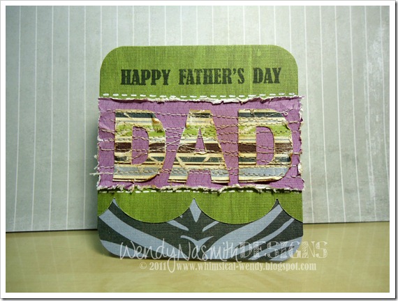
I know I shouldn’t blow my own trumpet, but I really love this card. Its a CAS design that has used some rather feminine papers actually, but it worked out as a great Father’s Day card nonetheless.
Just in case you were wondering, I really don’t like using “male hobbies” as focal points for masculine card designs. Well, at least whenever I try to make a card with a cricketer or fisherman, for example, they end up getting filed under “bin”. It just doesn’t work for me and my particular style. Do you have any tips for designing masculine cards?
Enjoy the video below, which shows you the Silhouette Studio design aspect, as well as putting the card together. Please don’t forget to rate and subscribe to my YT Channel. Also, if you ‘follow’ my Facebook and Twitter pages, then you’ll always know when my next video/blog post is up.
Father’s Day is really truly only just around the corner now {which means so is my 30th birthday, but hopefully that won’t be too traumatic!!} so here’s another design that you can use to create a nice card for your Dad.
I created this design for a craft day with my friend Katherine, who is more used to working with glass, and has never made a card before and really wanted to give it a go. So I kept it fairly simple, but still, there are quite a few techniques going on in the card. I wanted her to have a good play around with paper techniques!
We also messed around with combining some glass techniques with my paper craft and came up with some really beautiful pieces (sparkly silver swirls on blue fused glass – gorgeous!!). I will have to show you those when I get a picture from her.
Techniques used in this card were die-cutting (lots of), eyelet setting using a crop-a-dile, faux stitching and corner chomping. So the video ended up being 10 minutes long!
Enjoy the video below,and please don’t forget to rate and subscribe to my YT Channel.
Should have left the top two corners square (Put. The. Corner. Chomper. Down!)
Maybe white embossed the sentiment?
But I’m not going to get hung up over these two things that I’d like to change! Enjoy the video, please don’t forget to rate and subscribe to my YT Channel.
It’s time for another Silhouette Studio tutorial! This card is made in its entirety with the Silhouette/CraftRobo machine and is super simple to design using the SS software.
This design requires the above software. Please feel free to click on the image to take you straight to the download page of their website. If you have a Silhouette or a CraftRobo machine, you should be able to download and use this software as they are both the same machines, that (for some strange reason) are sold under different names in different countries.
This card is a masculine card – all you need to do is pick some strong masculine patterned papers and you’ll have a great card for all the men in your life!
Please don’t forget to rate my videos and subscribe to me over at my YT Channel. Also, if you ‘follow’ my Facebook and Twitter pages, then you’ll always know when my next video/blog post is up.
A request from a rugby-mad friend of mine for his birthday, who supports Leicester Tigers! I used my CraftRobo to cut out the card and the swooshes, which I designed for this purpose. Suffice to say, the designing took far longer than the actual making of the card…great fun though and he was suitably impressed for it to be worth the entire afternoon of designing =)
Happy Birthday Joe!!
This photo is of the birthday boy and his wife – appropriately masquerading as TIGERS at our recent Friends’ Christmas celebration. We were all ‘Tigered’, myself included. It was very surreal but most excellent fun ;-) He’ll kill me for going public with this photo, lol!
A similar version of this card was for my brother’s birthday! I wanted something masculine, but not dull and monochrome but bright and cheerful. So this card was born!
The glossy accents I’ve used on the circle punch outs really lift the colour in them – they almost look like shiny brads! Speaking of which, in my next video, I’ll show you how to make patterned brads to match any project, such fun =)
I love this embossing pen as it has two tips, one thick, one thin. Perfect for frame borders and embossed writing! And it stayed wet long enough to hold the embossing powder for a perfect finish. Love it!
For sale: It’s also available to buy in My Folksy shop at this link. Your support is gratefully appreciated =)
As usual, the video is below. If you enjoyed it, please head over to my YT Channel to rate & subscribe. Don’t forget to “follow me” (link on the side of my blog) to keep up-to-date with my most recent posts.
I know, I know – this is slightly different to the video – but after I finished shooting, I decided I wanted to see what it would look like with the brown lettering on the sentiment, rather than the lily white letters they began as…so I used my copic markers and coloured them in dark brown and stuck them back on the card (similar to what I did in this video here). I rather prefer it this way, but it was too late to go back and reshoot the video.
I figured you’d all get the idea though so I didn’t need to reshoot =)
The ‘happy birthday’ stamped flags were inspired by Kristina Werner, who’s work I adore (similar to her card in this post)! I’ve been told I have a Kristina Wernerish style, so it’s no surprise that I just LOVE her work and that I’m constantly inspired by her creations!
Another Father's Day card for those of you still stuck for ideas for masculine cards. Men are just so darned hard to create cards for, but I actually enjoy the challenge. This card is quite bright and summery, but still retains just enough 'masculinity' to work as a card for a Dad (I hope!).
I was initially inspired by this card and this card by Kristina Werner but I got a little bit over excited when creating my card and forgot to adhere the vellum on before anything else…and once that glue is stuck, there’s no getting it off for love nor money! So I had use another technique for holding the vellum in place on that bottom right corner.
So, working with the design I had in mind, I just used the stickles a little further down the card than I had planned, and ‘glued’ the vellum edge down with a few blobs of stickles.
And because the rainbow polka dot c.s. that I used just below it had glitter blobs on it too, it kind of looks like it’s meant to be falling into the next part of the design. Phew – card saved from the scrap heap!
Below is the video as usual, please don’t forget to head over to my YT Channel to rate & subscribe if you haven’t already! I’m nearly at 1,000 subscribers (!) so I’m super-happy and grateful to you all for your support.
Well it's been a beautiful day here in the UK - summer is well as truly on its way! I love June, for many reasons, but it's my birthday month, so that's another reason to love it.
This card is for my Dad for Father's Day. I've used a Martha Stewart deep edge border punch and slightly customised it to create the shiny black trellis border at the top. I think that gives the ric rac ribbon some balance nearer the bottom of the card.
I've been doodling all over with my white gel pen! I did some 'morse code' doodling around the "Best Dad" sentiment and doodled the "in the world" to mimic the doodlebug rub ons. And of course, not forgetting the faux stitching around the edge =)
The video is below. I hope you enjoy it and that it gives you some inspiration for your own Father's Day cards this year! Don't forget to head over to my YT Channel to rate and subscribe.
I made this card as a commission for a customer. It was for a male recipient, but I didn’t let that stop me from using a flower! Flowers are there to cheer anyone up, right?
It is a fairly simple card, and if I had enough micro chip stickers I could’ve made quite a few…but I’m running very low on my Basic Grey chipboard stash! However, there's a couple for sale in my Folksy Shop if you'd like.
I’ve also had to change my video editing software and it’s taken me quite some time to get to grips with the new one with all it’s quirks and the templates I’ve had to reprogramme. But it’s all done now and soooo much better than my old program.
Below are some more photos, of a similar card I created using the same layout and papers, but with a different sentiment. I hope you like it! The video is also below – please don’t forget to head over to YouTube to rate & subscribe =)
This card is for my Father-in-law who’s 58 today! It’s a single layer card, so I’ve also added to Kristina Werner’s One Layer Card Challenge. Single layer cards are difficult! The temptation to add extras to it was almost unbearable at times, but I did have fun challenging myself to stick to the one layer, and made it doubly difficult for myself by making the challenge card a masculine one too!
I’ve made it using black c.s. which can be a difficult colour to work with, but this c.s. has a nice embossed pattern in it, so it’s not just a block of black, there’s a subtle pattern there too.
The Happy Birthday sentiment was stamped with Papermania’s Alphamania stamps, and I was inspired by an idea from one of Kristina’s earlier cards to stamp them with Versamark in a circle using a masking technique. I then embossed using white e.p., faux stitched around the edges and added some clear embossed stars around the outside just to help break up the expanse of black a bit more.
No video tutorial for this one – but I am currently editing my ‘Sneak Peak’ video for a card I made the other day, which should go up later on today. I just didn’t want to miss entering this card for Kristina’s challenge which ends in a few hours.
Yet another of my friends turned 30 recently. I now feel so young – still just over a year to go for the big three-oh for me, he he! ;0) My wonderful Dad also turned 60 last month, so I made a very similar card for him too (in fact his was the 1st!). For both cards, I’ve used some masculine-esque papers and done some antiquing using distress inks. This looks great as an edging effect and has the added bonus of covering up any errant craft-knife slip ups when cutting out! You could cut out such a card using a CraftROBO, but I fancied doing one by hand. Also, the cardstock I used was quite thick, so maybe a little much for my little ROBO. The ‘30’ card has the fold on the top edge, and the ‘60’ the fold is on the left.
These cards would’ve taken far too long to film, so I just had fun at my craft desk and went ahead and did them without the video. I don’t do this often enough! However, I may make a similar card to these soon and film it, now I know what I’m doing and can probably go a little quicker =)
As for how I made these cards, I first made a template for these in Illustrator and printed it out on some copy paper. I then stuck it with removable adhesive onto the card front, onto which I had already stuck the patterned paper, using spray glue. Using a craft knife (and a lot of patience!), I cut out the template. I then sanded all my cuts using the Basic Grey Precision file set, & distressed all the edges using Distress Inks. I faux stitched all around the edges, added the ‘birthday’ stickers, then added the tag with an eyelet.
I really enjoyed making these cards, and they were definitely worth the effort, but they certainly aren’t ones you can whip up in half an hour!! I think each one took about 1.5hrs…both men loved their respective cards though - success!! Hope you like them too.
I had done a video for this card…but it’s never made it to the editing stage. But I figured I can’t make a video for every card I create – there’s just not enough time! So I will just talk you through what I did instead.
This area of the card has been embossed with a cuttlebug folder, but I added a twist. Before placing the patterned paper into the folder, I rubbed one side of the folder with some versamark ink. This ensured that all of the none embossed bits (i.e. not the raised stuff) got inked, meaning that when I took it out of the cuttlebug I could hit it with some clear e.p and heat emboss it. The overall effect was that the depressed bits looked almost wet where the e.p had ‘pooled’. You could increase this effect by using UTEE.
I then cut this to size, added another contrasting piece of patterned paper from the same paper stack and stuck to the base card, inking in orange around the top patterned paper. I tied a thick piece of ribbon around the join and tied it off the edge of the card using string.
The sentiment was a combination of chipboard letters and white gel pen handwriting on card cut using the Labels1 Nestibilities dies, adhered to another slightly larger label from the same set and mounted onto the card using 3d foam stickers. The addition of 3 green eyelets to balance the card and the card is complete.
Today's card is a VERY masculine card. It's for my brother who celebrated his 32nd birthday this week. He's really into all things metal - he's always tinkering with cars in the garage and he likes everything to be 'just so' - hence the card I've created for him is very balanced/symmetrical, very metallic and no-frills. It's not necessarily my kind of card (if I'm truly honest, it's really not my thing!) but it just know he'll love it. I hope you will like it too, but I understand if you don't as this is not everyone's cup of tea ;0)
The card incorporates real metal, from a Pepsi can I (very carefully!) cut up, flattened, punched out several squares and cuttlebugged using the Swiss Dots embossing folder. I've used thin chipboard squares to create a chess board effect alongside the metal squares. I stapled the chipboard squares in a cross just to add to the metal theme. I then had to run these through the Cuttlebug to flatten the staples to allow me to adhere them down to the project. I did this by stacking my A plate, an embossing folder (with nothing inside it - this is just to pad out the stack), then a B plate (embossing plate), a piece of card to cushion the staples and a final B plate (cutting plate).
Sounds complicated, but essentially all I've done is create a stack thick enough to compress the staples, without causing damage to my machine ;0) You may need to vary this stack as each machine may differ. DON'T FORCE your machine, just remove a layer of c.s. if it's too difficult to turn the handle.
The sentiment part of the card uses a Fun Doodle Tags stamp set from MyGrafico.com (no longer available from MG, the link to the designer's website, Pixels&IceCream, can be found here). I just *HEART* this stamp set! It has so many uses! I'm always flapping around trying to find something suitable to stamp my sentiment onto, so this a great stamp set that's a must-have for everyone's crafting stash. And don't forget, as it's digital, you can resize any of the 8 tags to fit any width of sentiment, and therefore to suit any project - so that makes it great for scrapbooking too.
So, the video is below. I hope you enjoy watching me make this card - if you do, please hop over to YT to rate and subscribe. Your comments are always appreciated and I hope it inspires you to be ever more creative with those pesky masculine cards!! ;0)
This tiny but scrumptious looking Forever Friends iced bun stamp was calling to be used on a card. I couldn’t think of any way of fitting it into a card without it being the main focal point, so I made a smallish 4” x 4” card so as not to overwhelm the stamped image.
I also recycled some lavender cardstock that I’d made a mistake on creating another card. It was not quite big enough for the base card for this card, so I added another bit of lilac cardstock on the bottom and decorated it. This way it fit into my design for the card and used up some ‘mistakes’ from previously.
I have also done a video tutorial on creating this card, below. It is a very fast card, especially if you keep the base card whole (with the right size cardstock!) so this basic design could easily be reproduced for Christmas cards, substituting the iced bun/cupcake and colours for something Christmassy!
You could get 20 done in no time at all, by creating the competent pieces en masse then assembling all 20 at the end.
Don’t forget to click on the HQ button in the right hand corner after pressing play. Hope you enjoy the video, please hop over to YouTube to rate & subscribe. Thanks for watching ;0)
I made this card a few weeks back, but have only just got around to editing the video for it this weekend. Life's crazy busy at the moment, which is great, but it doesn't give me a whole lot of time to be sitting at my PC publishing videos!
I have four weddings to go to this year, and all the hen nights associated with them, so it will be a very busy summer! But don't worry, I'll try to do as many tutorials as I can ;0)
This card was an idea I had just staring out of a window....frames within frames....
I think it would be a great card for a man (perhaps without the salmon pink!) but the basic idea would be great if you're stuck for ideas for Father's day!
As you can see, some of the frames are raised using 3d stickers and some are flat to the base card. This was just to give some added interest so the card wasn't completely flat, however, it would be fine if they were all stuck flat too. I am just incapable of making a card without the use of some dimensionals! In fact the only card I have made that was completely flat, I hated, and refused to publish online ;0)
Anyhoo, here's the video below, don't forget to watch it on HQ....please head over to YouTube to rate & subscribe - thanks!
Hi there! Well I'm on a role with these masculine cards....the designs seem to be coming to me easier these days, and dare I say it - I'm actually beginning to ENJOY making men cards (gasp!) or at least not dread them half as much as I used to.
I decided to stick to 1 colour, but using various shades, as I'm still experiementing with adding colour to my designs. I'm not at all trained in design or use of colour, so this doesn't always come as easily as I'd like. Plus, I'm on a budget, which means I haven't got a zillion packs of designer paper that all tie in with each other (more's the pity) I simply have to make do with what I've got and dream of winning the lottery to pay for my craft addiction. ;0) Below is the video tutorial of me making this card. When I did the voice-over I was R-E-A-L-L-Y tired, so I apologise if I sound like I was about to fall asleep - I was completely shattered. My new video is already recorded and in the pipeline, so keep checking back for next next post....enjoy!!
PS: If you follow this link over to YouTube, and click on the little 'HD' icon in the bottom right hand corner of the video, you can watch this in higher quality (recommended).


 The card is round, as it’s to represent a cd or vinyl disc, sticking to the music theme. Plus it makes it a bit different to the rectangular/square cards that seem to dominate the card market.
")


 The bits I like:


 The glossy accents I’ve used on the circle punch outs really lift the colour in them – they almost look like shiny brads! Speaking of which, in my next video, I’ll show you how to make patterned brads to match any project, such fun =)


 This card is for my Dad for Father's Day. I've used a Martha Stewart deep edge border punch and slightly customised it to create the shiny black trellis border at the top. I think that gives the ric rac ribbon some balance nearer the bottom of the card.


 I’ve made it using black c.s. which can be a difficult colour to work with, but this c.s. has a nice embossed pattern in it, so it’s not just a block of black, there’s a subtle pattern there too.


